Mizone “Refreshing Grass Flavor” Limited Edition Packaging Design
Brand Collection
Interbrand X Mizone
Project Type
Limited-Edition Beverage Packaging Design
Core Objective
Convey "natural vitality" and "outdoor joy" through visual design, reinforcing Mizone’s "refreshing energy" brand identity while appealing to young consumers in spring outdoor scenarios.
Project Background
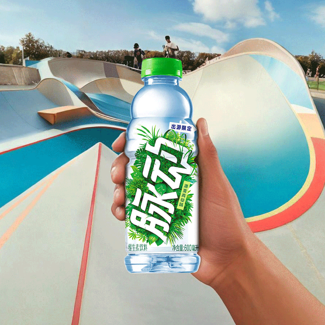
Considering the Mizone 2025 social platform campaign, the brand sought innovative ways to engage consumers. As springtime outdoor activities grew in popularity, Mizone launched a limited-edition “Refreshing Grass Flavor”, inviting consumers to enjoy a sensory experience akin to a “spring picnic on your tongue”.
As one of the major visual strategies for the campaign, the new Mizone bottle packaging was designed to serve as a hero and prominent campaign visual signal. Interbrand was brought on to craft the packaging with the following key objectives:
This version maintains the original message while aligning it with your requested structure, emphasizing the campaign context and packaging's role as a key visual driver .
Differentiation
Stand out on crowded beverage shelves.
Contextualization
Evoke emotional connections by associating with "outdoor adventures."
Brand Consistency
Maintain Mizone’s "energetic freshness" visual language while incorporating seasonal innovation.
DESIGN STRATEGY
*
DESIGN STRATEGY *
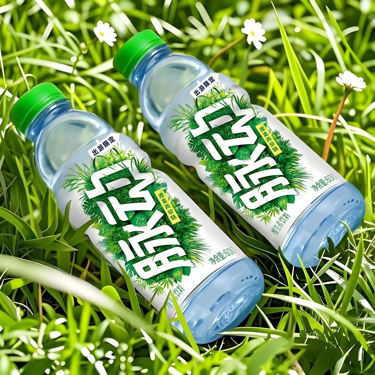
Key Themes
Natural Vitality · Crisp Transparency · Interactive Fun
Color Palette
Dominant fresh green paired with white negative space, mimicking grass and clear skies to reinforce "refreshing" taste associations.
Botanical Motifs
Natural backgrounds wrapping the bottle, symbolizing organic growth.
Brand Integration
The "Mizone" logo blends into the foliage, with leaf details emerging from the typography for playful dynamism.

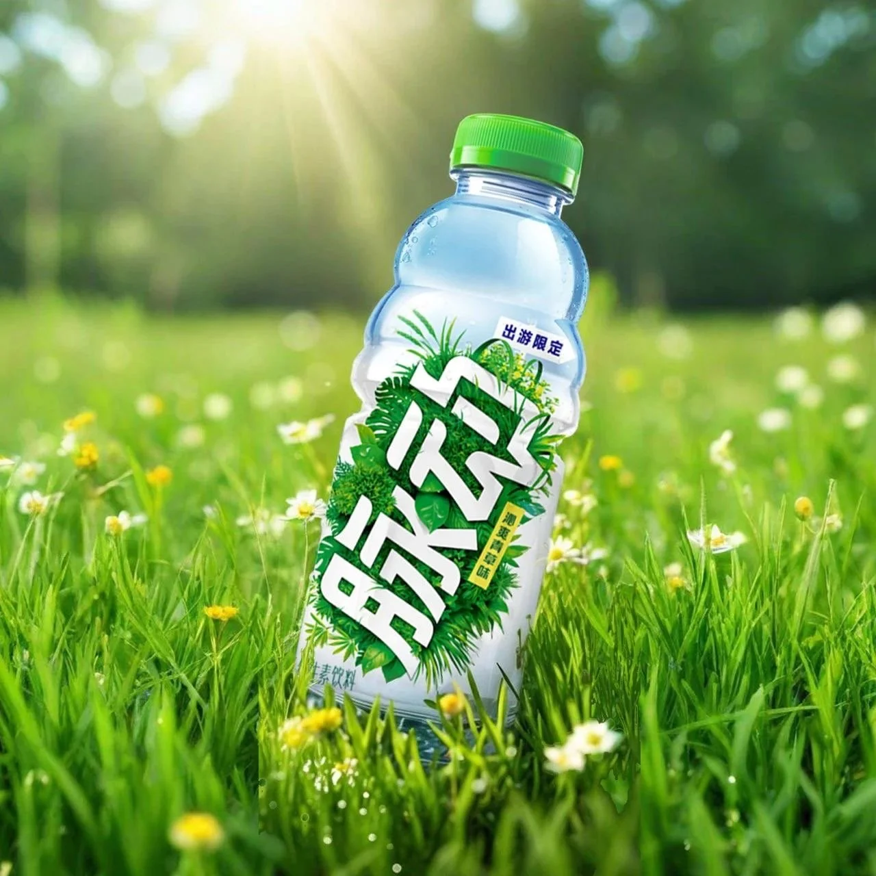
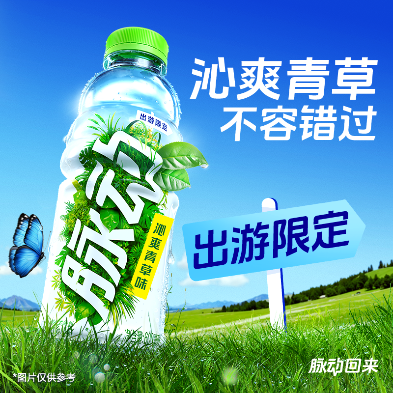
Peek of the final design
Each sip feels like a stroll through spring
Iterations
Below showcases my design iteration process from early stage to the finalizations
Version 1
✅ Clean but dull. Add soft sunlight/greenery shadows for "spring" vibe.
Version 2
✅ Good for social media. ❌ Missing USPs Add bold text/icons.Sunny Grape").
Highlight USPs with icons (e.g., "Vitamins + Electrolytes").
Version 3
✅ Balanced design. ❌ Overlit—fix label visibility. Test mobile readability.
IMPACT
!
IMPACT !
30%
60%
40%
Market Performance:
Exceeded sales targets by 30% in the first month , becoming the top-selling spring limited edition.
Online (E-commerce & DTC):
Contributed 60% of total sales , driven by social media campaigns, livestream promotions, and influencer collaborations.
In-store (Retail & Convenience):
Accounted for 40% , with standout demand in urban convenience stores and supermarkets , where the limited-edition packaging boosted impulse purchases.
56%
5M+
1,200+
3M+
User Engagement:
Increased organic social share.Exceeded sales targets by 30% in the first month , becoming the top-selling spring limited edition.
Weibo:
Viral UGC (user-generated content) around the limited-edition packaging , with hashtag views exceeding 5M+
Xiaohongshu (The RedBook):
1,200+ influencer-generated posts driving discovery, with "refreshing spring flavor" as a trending keyword.
Douyin:
Short-form unboxing videos and "thirst-quenching" challenges boosted reach, generating 3M+ engagements .

Design Reflection
Successes
Seamless fusion of nature and brand assets balanced innovation and recognition.
Future Ideas
AR integration (e.g., scanning the bottle to trigger spring animations) could deepen youth engagement.